Sipleco
Services:
Naming & Tagline
Identity design
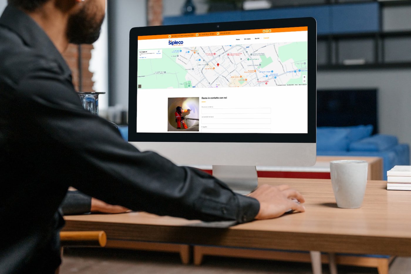
Website
Collateral design
The Business
Sipleco is a company founded by two Romanian friends who worked for over 15 years in silo cleaning services in Italy. When they decided to start their own business, they realized the need for a visual identity, so they turned to me for help.
The name & tagline
The project didn’t start with naming exploration. It started with a positioning problem.
The clients initially chose the name “TOP QUALITY.” While it sounded positive, it created three immediate issues: it was generic, difficult to own in search and communication, and almost impossible to secure across domain and social media.
Instead of validating the name, we reframed the conversation around distinctiveness and memorability.
The objective became clear: create a name that feels ownable, works across Romanian, Italian, and English, and supports long-term positioning.
During research, we looked for a conceptual anchor connected to the nature of the work — cleaning inside complex industrial environments. This led to the Pleco fish, known for cleaning algae from surfaces. The reference felt relevant because it communicates function in a subtle, memorable way without becoming descriptive.
By associating “silos” with the Pleco reference, we developed the name Sipleco — an invented name that feels technical, distinctive, and scalable.
Because the name is abstract and the business was at an early stage, we used a descriptive tagline to reduce ambiguity and clarify expertise:
Silos cleaning experts.
The tagline was designed as a temporary clarity layer, not a permanent brand statement.
The logo
The logo direction was driven by positioning, not aesthetics.
After analyzing competitors, it became clear that most visual identities in this space rely on industrial clichés and look interchangeable. The opportunity was to introduce a mark that feels modern, professional, and recognizable at a distance — especially through color and simplicity.
A key observation from field research informed the symbol. Workers operate suspended on safety ropes inside silos, often in a posture that visually resembles the letter “S.”
This operational reality became the conceptual foundation of the symbol.
The first letter of the name was stylized to reflect that suspended movement — creating a mark that subtly communicates the nature of the service without relying on literal industrial graphics.
The result is a symbol grounded in real behavior, not decoration — reinforcing the brand’s focus on expertise, precision, and specialized work.